Video
If you open the video on YouTube, you can find the chapters of the different settings in the description.
Adjusting mobile menu
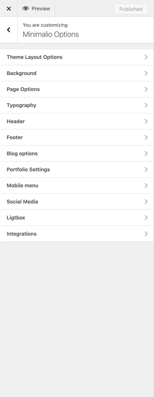
To adjust mobile menu, go to Theme options -> Minimalio options -> Mobile menu. These options are only available with the Premium Minimalio plugin.
Breaking point
Breaking point is the width of the display, when the mobile menu appears, instead of the normal menu. This is very useful, if you have a very long menu, that would break the header on smaller screens. Try changing the size of your browser and set it accordingly. You can also use this, if you want to use the mobile menu even on desktops. To do that, set the breaking point to 4096 minimum.
Mobile menu style
Choose between Right side mobile menu and Full width menu. The difference is only visible on bigger screens.
Mobile menu logo
In Theme options -> Site Identity, you can set up three diferent logos, that than could be used in the mobile menu.
Mobile menu colors
You can choose the Icon bars color, so that is the color of the icon when the menu is closed. When it’s open, there is a color of the top, the body, the closing button and the font color.
Mobile menu font
You can also choose the size of the mobile menu font, it’s style and it’s letter spacing.
