Summary
It’s easy, it shouldn’t be more than 1440px. Anything underneath that is good, and it’s basically a design choice. This article explains why and how to adjust the width of your content.
To box or not to box
Why even box the content? It almost always looks better, especially on large monitors. My monitor for example is super wide with aspect-ratio of 2,39:1. So unless you have a Hollywood movie playing on your website, it’s not going to look good.
60-80 Characters rule
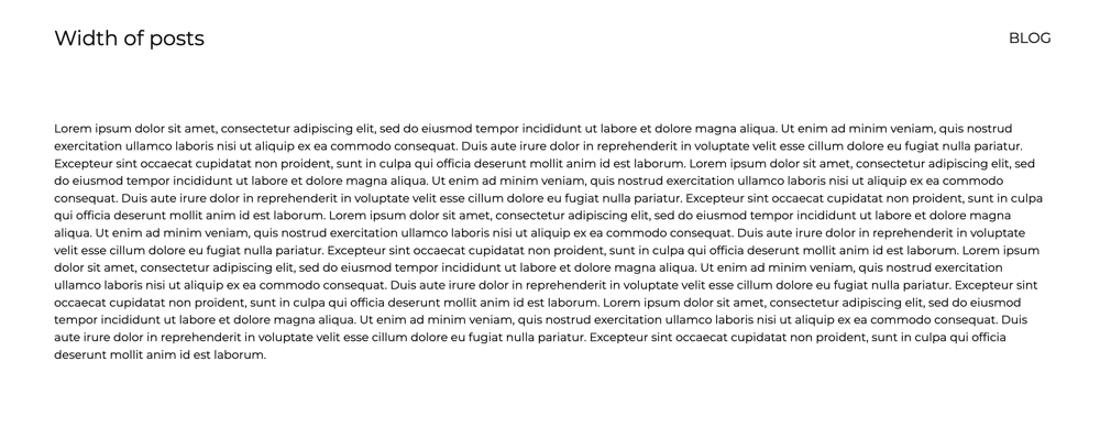
If you want people to read anything on your website, there shouldn’t be more than 60-80 characters in one line of the text. That is a rule! That’s because reading a text that is super wide, is really annoying, every time the line ends, your eyes have to travel all the way to the beginning of the next line, and you don’t want to do that. Simply put, if you don’t abide by this rule, your website is not going to look good!
You see, it’s terrible:
Modern designs use REM values
What is a REM value? It’s easy, it’s the size of your paragraph font. And that should be 16px. So one REM is 16px. You could change it, but you shouldn’t. The 16px is a standard and pretty much everybody uses that.
And from those 16px then come the whole design structures. So in modern designs, kind of everything turns around these 16 pixels, simply because it looks better, we might not know why, when we look at it, but it does. Margins, paddings, line-height, etc.
And therefore, the width of your website should be some kind of multiplication of 16!
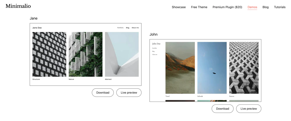
1440px (90REM)
This is a rather larger width, which is very common if you want to cover the whole screen of modern laptops. But your content has to be ready for it. You might even combine this width with some smaller one, for example having 1440px for your homepage, with some nice large pictures and e.g. 960px for your blog posts.
Example of 1440px – Minimalio demos.
1280px (80REM)
This might be the most common one. It’s perfect for two column grids, when you have some kind of graphic or image in one column and your text in the other. I would recommend you to use this width for most of the websites.
1120px (70REM)
Here we are getting little old school. I personally don’t like this size, it’s not wide enough to show content on modern laptops in some reasonable manner, but it’s also not a narrow one for showing text only. Maybe for like websites with posts in a wider column and a sidebar in a narrower column, this might be a good width, though.
960px (60REM)
This is not even old school, I would consider this a design choice nowadays. And it might be a very good one. If you have a large amount of text, put it in this narrow column, and it might look very elegant or minimalist.
What about tablet and mobile width
This article has been written in 2025 and nowadays, the website should be fully responsive. So you shouldn’t specify anything when it comes to smaller sizes than what we have discussed above. And that goes not only for the width of the whole website, but also the typography. Modern websites use what is called fluid typography, so that the fonts start to shrink at some point and stop shrinking when you get to phone territory. You can check that behavior on any of the Minimalio demos.
How to adjust the width
Either, you have a nice theme like Minimalio and you just go to the Theme options and set your desired number. Here is a tutorial video on layout.
If that is not an option in your theme, you can do it with custom CSS. The rule you are after is called max-width. So, for example, if you only want to change the width of the content of a single page:
article.page {
max-width:960px;
}
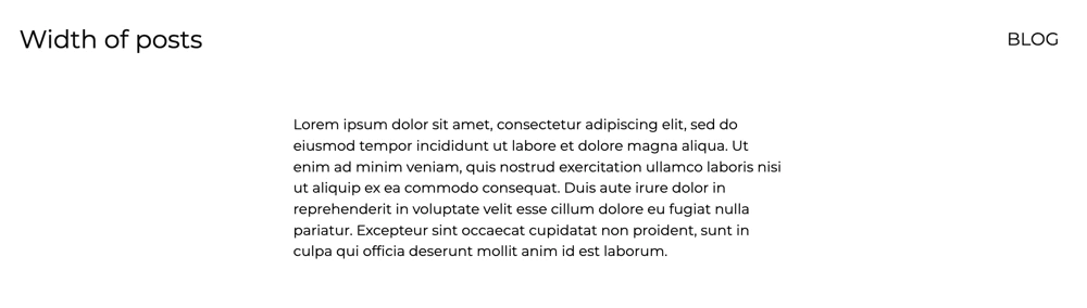
Make your content narrower with Gutenberg
This is especially important for blog posts. There are several ways making your content narrower either with settings of the Gutenberg blocks, or with some custom CSS.
Use Gutenberg columns
This is probably the easiest and also most versatile option. The only issue is, that you have to put everything in columns, which might be time consuming, especially if you already have your content in the website. If you don’t, then just do it once and then duplicate the columns.
So, if you add columns in Gutenberg, it shows you options for adding different sizes of the columns. So for example the 25-50-25 is perfect for this. You can also adjust the width, but be careful, and always use percentage!
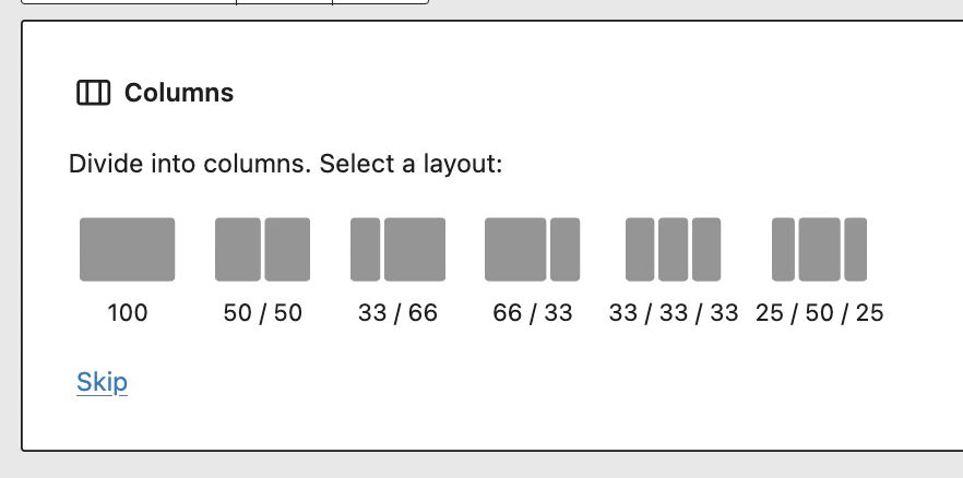
Then you just add your text in the middle column and boom, it’s done.
Use custom CSS
There are several ways of doing this with CSS, the important a difficult part is to find the right class. To do that, you basically have to use the developer tools in your browser, or you might be lucky. Here is a video tutorial for beginners how to use Custom CSS.
I would recommend two ways, either use the max-inline-size with character count. So for example:
.single-post p {
/* makes the paragraph only 60ch in one line */
max-inline-size:60ch;
/* margin auto centralizes the paragraph */
margin: 0 auto;
}
Or use the max-width:
.single-post p {
max-width: 768px;
margin: 0 auto;
}
As you can see, this only applies to paragraphs, you might want to do this for your whole post, or just some parts of it, it’s up to you.
Good luck